Star Charting Apps for iPhone and iPod Touch
| iAstronomica |
| iAstronomica |
iAstronomica is the most basic of the seven major star-charting apps. It omits fainter stars and deep-sky objects, focusing instead on the constellations, planets, moon, and Milky Way.
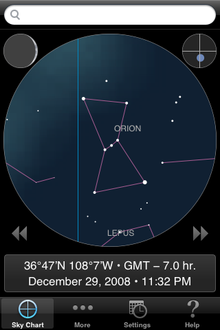 |
iAstronomica shows only the brighter stars, as you might see them under a full moon or from a light-polluted city. The magnitude limit is approximately 4, but even the magnitude-3.3 star Eta Orionis, below the right star in Orion's Belt, is omitted from the database. Constellation lines are always turned on, but names can be turned off, or set to disappear when the chart is zoomed out. Notice that the star chart is confined to a circle, with other information occupying the rest of the screen. The small circle at the upper right shows what part of the whole sky you're currently looking at. The moon's phase is always shown at the upper left. |
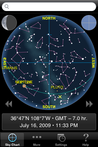 |
This is one of only two apps that offer a full-sky (180°) view, but you can't look below the horizon as in GoSkyWatch. The Milky Way is drawn attractively, and the ecliptic is always shown as a green line. |
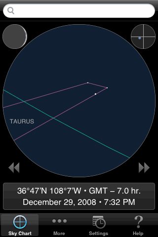 |
Only three Pleiads are bright enough to be included in iAstronomica's limited database. The app identifies the brightest one as Alcyone, and the others merely as Pleiade1 and Pleiade3. Presumably these are Atlas and Electra (the next two in order of brightness), but if so they should be plotted almost along a straight line--not making a right angle as shown here. They should also appear closer together in this wide 18° field. This is just one example of how iAstronomica plots the stars somewhat inaccurately. Almost any constellation, zoomed in to this level, will appear a little wrong when compared against the actual stars. I notified the developer of this problem soon after the app was first introduced in July 2008, yet it has not been updated since then. |
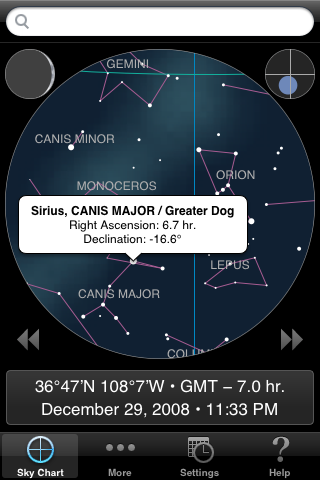 |
In iAstronomica you identify an object simply by tapping on it. A small popup then appears, until it is tapped again. For stars, the popup provides the name and equatorial coordinates. Some of the fainter stars are identified as simply "No name". Given that this program is targeted to novice observers, I'm puzzled over why the coordinates are given in equatorial form, rather than altitude and azimuth (or perhaps rising and setting times) which would be much more useful. |
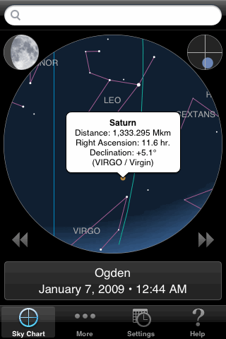 |
iAstronomica uses orange dots for planets, with names always shown next to them. When you tap on a planet you get a popup with some additional information. (The popup is covering the name in this image.) |
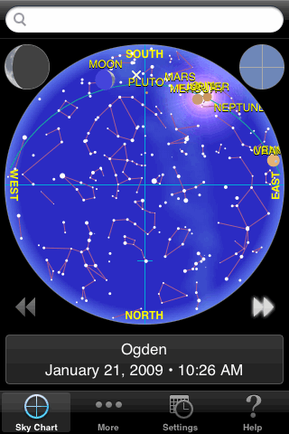 |
The time animation buttons are always visible in iAstronomica, just below the circular chart. The animation is slow, however, at only about one frame per second; the slowness makes it easy to single-step by simply tapping the button twice in succession (turning the animation off after the first step). To change the size of the time step you have to get into the settings menu, where the choices are one minute, one hour, one day, one week, or one year. It needs a setting of 5 or 10 minutes, and one for a siderial day. Still, this is a good app for learning how the stars move through the sky. |
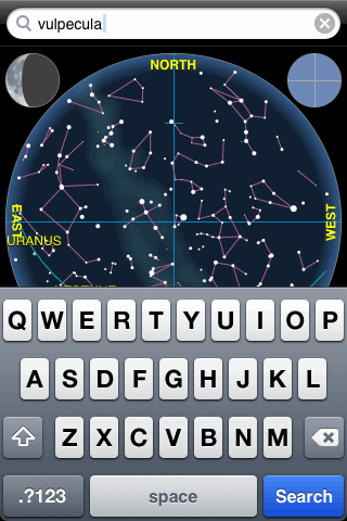 |
iAstronomica simply offers a search field that's always visible above the chart (in bright white, which isn't good for dark-adapted eyes). Tap in the field and the keyboard appears, allowing you to type in the name of a planet, star, or constellation. At the same time, the chart zooms all the way out to show the full sky. If you type the name of an object that's currently below the horizon, the search will fail. You don't have to type the full name of an object; any subset of the name will do. When more than one object qualifies, they're all highlighted. |
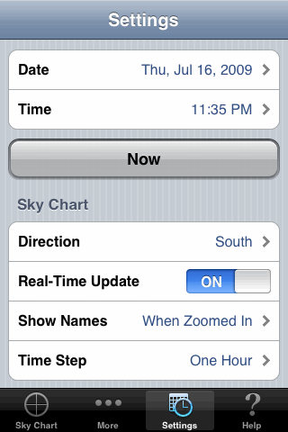 |
Just one tap in the toolbar takes you directly to this Settings menu, which includes the items shown here plus the location settings (scrolled off the top). This app could be improved by giving the user more control over what's shown in the chart. |
Ease of Use Rating: 
For what it does, iAstronomica is definitely the easiest to use of the seven star-charting
apps. The user interface is straightforward and the help screen is written for beginners.
Information Content Rating: 
There's no excuse for plotting the stars so inaccurately. And even without this problem,
this app would still show the fewest stars and no deep-sky objects.
Fun Factor Rating: 
This app will be fun for beginners who want to learn the basics of the
night sky. The graphics are nice but not spectacular, and the time animation is
frustratingly slow.
Creator's Web Site: www.artistictechworks.com
Back to main page: Star Charting Apps for iPhone/iPod Touch
Last modified on 23 January 2009.