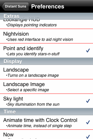
The Preferences button in the toolbar takes you directly to this long scrolling menu of settings. (This image also shows what all the menus look like with night vision mode turned off; I usually just leave it turned on since the menus are easy enough to read in red-on-black.) The preferences list is fairly complete except for the magnitude limit which has only two choices.
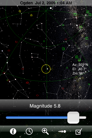
Tapping the fourth toolbar button in GoSkyWatch brings up the magnitude limit slider. It's good that this control is so accessible, because you'll want to use it often as you zoom in and out over GoSkyWatch's extraordinary zoom range (with no adaptive zooming).
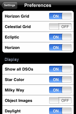
Tapping the rightmost button takes you to a short menu listing Location, Date & Time, Night Mode, and Preferences. Shown here is a portion of the Preferences menu, two taps away from the sky chart.
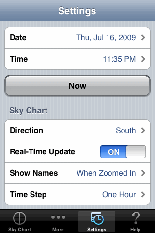
Just one tap in the toolbar takes you directly to this Settings menu, which includes the items shown here plus the location settings (scrolled off the top). This app could be improved by giving the user more control over what's shown in the chart.
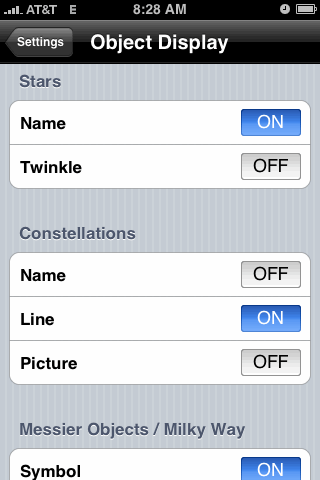
The Settings button in iStellar takes you to a menu with several submenus, including Location, Time Zone, and Animation Step. This image shows the longest submenu, Object Display, which lets you turn just about any chart feature on or off.
Instead of an explicit magnitude limit for stars, this menu includes a slider for Light pollution intensity--but it's active only when Daylight/Twilight is also turned on, obscuring the stars completely when the sun is up. While this approach is certainly realistic, it can also be a little annoying.
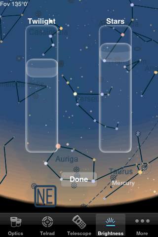
One of Starmap Pro's most useful toolbar buttons is the brightness control, shown at left, which has separate sliders for the sky background (black to light blue) and star image size.
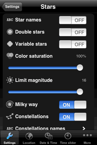
Separate toolbar buttons let you set the location and time. The Settings button handles almost everything else, taking you first to a menu listing Navigation, Solar System, Stars, Deep sky, and Colors. A separate page gives you access to each of these groups of settings. The color settings are a good idea but rather poorly implemented, with an incomplete range of hues and no control over saturation. It does give you separate control over the colors of most of the lines, text, and symbols that appear on the chart, but doesn't let you assign separate colors to different categories of deep-sky objects.
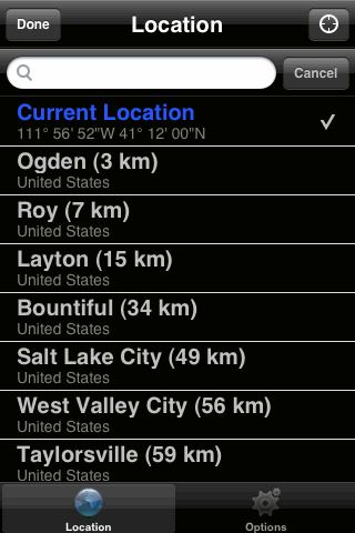
Star Walk has almost no settings menus; instead, the app uses adaptive zooming to make names and constellation lines appear and disappear. But the green button in the bottom-right corner of the screen takes you to the menu shown here, where you can set your location either using Location Services, or by choosing a city from a very long world-wide list. (Unfortunately you can't simply set your longitude and latitude.) The Options button takes you to another screen with only one option, to turn night-vision mode on or off.
This app could really use a few more options, such as hiding names and lines and pictures regardless of the zoom level, and changing the way planets and deep-sky objects are displayed.
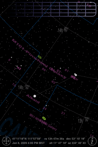
Uranus has a single brightness control that dims the constellation lines, constellation boundaries, and all the object labels shown in pink in this image (which disappear anyway when you zoom out). To access this control you tap and hold at the top of the screen, then slide left or right along the grid thingy.
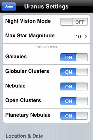
Meanwhile, tapping the "i" button in the bottom-right corner of the Uranus screen takes you directly to this menu, which doesn't include much more than you see. Obviously the emphasis here is on the deep-sky objects. The magnitude limit can be set as high as 22, but I'm not sure why; the database seems to be very incomplete above magnitude 10, and includes fewer than 500 stars above magnitude 14.