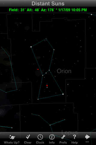
No frills here: a very simple set of lines to connect the brighter stars, and no artist's conception of the great hunter. Notice also that the stars are rather dim. This is a good thing for night vision (since night vision mode affects only the menus, not the sky chart), but creates a challenge if you care about the fainter stars.
The "Clear" button in the toolbar, incidentally, provides a quick way of turning off all lines and labels so you can see just the stars; tap it again to restore whatever lines and labels are turned on in the Preferences.
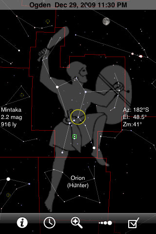
GoSkyWatch will draw constellation stick figures, boundaries, and/or artist's pictures. (There are no pictures for the most southern constellations.) The stars are drawn plainly but clearly, in colors that are usually too subtle to detect. The name of the centered constellation is always shown toward the bottom of the screen, even when that area falls within a different constellation.
The single toolbar provides quick access to all the app's features: identifying objects, setting the time, searching, adjusting the magnitude limit, and the other settings.
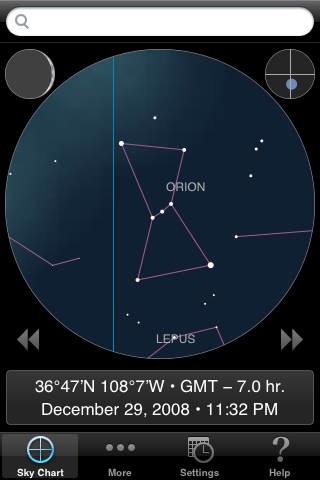
This app shows only the brighter stars, as you might see them under a full moon or from a light-polluted city. The magnitude limit is approximately 4, but even the magnitude-3.3 star Eta Orionis, below the right star in Orion's Belt, is omitted from the database. Constellation lines are always turned on, but names can be turned off, or set to disappear when the chart is zoomed out.
Notice that the star chart is confined to a circle, with other information occupying the rest of the screen. The small circle at the upper right shows what part of the whole sky you're currently looking at. The moon's phase is always shown at the upper left.
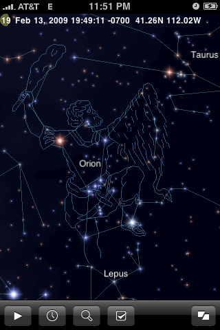
This is iStellar at its best: Gorgeous full-color stars, complete with diffraction rays, as well as artist's drawings for all 88 constellations. You can even make the stars twinkle, though I quickly tired of that feature. Constellation names, lines, and pictures can be independently turned off if desired. When you turn them all off, and don't use the light pollution feature, the unrealistic brightness of the numerous faint stars can make it hard to recognize some constellations.
As you can see, iStellar always displays the date, time, and location across the top, along with a tiny picture of the moon's phase. The number over the moon is the number of days since it was new.

For an app with so many features, Starmap Pro is rather spare in the constellation department, with simple stick figures and no artist's pictures. It will show constellation boundaries, but only when you select a constellation by tapping on it. Notice the nice star colors.
Starmap Pro has seven different toolbars, which you can view all at once by tapping the More button. So the tool you want is usually two taps away.
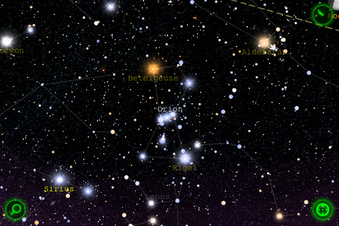
Star Walk's chart is always drawn in landscape orientation. The display is stunning, if slightly cluttered. The constellation lines are rather dim, and fade completely if you zoom in any farther than this. The constellation names also fade as you zoom in, while the star names fade as you zoom out. None of the lines or labels can be turned completely off. Star Walk also draws artist's pictures of the twelve Zodiac constellations and six others (Ursa Major, Ursa Minor, Draco, Lyra, Hercules, Pegasus), but not of Orion.
Instead of a toolbar, Star Walk has control buttons in the corners of the display.
(The trail of white dots near Sirius is apparently a graphics glitch in the background sky image.)
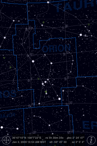
The screen of Uranus looks a lot like a printed star atlas. A single dimmer controls the constellation lines and boundaries, but the boundaries are always brighter than the stick-figure lines.