Explore this map to see where your electricity comes from!
Each dot represents an electric power plant, sized according to the amount of electrical energy it generated in the indicated year, and colored according to its primary energy source. You can zoom and pan the map, adjust the scale of the dots, and uncheck some types of power plants to focus on other types. You can also use the popup menu to scale the dots according to nameplate capacity or CO2 emissions. (Unfortunately there is no CO2 data for 2021.)
The URL displayed in your browser’s address bar stores all the map settings, so you can copy, save, and share your settings via the link.
Click or tap on any dot to see the data for that power plant (and a link to its location in Google Maps). Plant capacity is measured in megawatts (MW), or millions of watts. A typical American household uses electrical energy at an average rate of about 1000 watts, so a small 1-megawatt power plant can power about a thousand homes, while a large 1000-megawatt power plant can power about a million homes. A plant’s annual net generation is its average power output multiplied by the number of hours in a year (8760), and is measured in megawatt-hours (MWh). A plant’s capacity factor is its average output as a percentage of its nameplate capacity. Nuclear plants tend to have the highest capacity factors, followed by coal, gas, and hydro. The capacity factors of wind and solar farms are limited by the availability of wind and sunshine at each location.
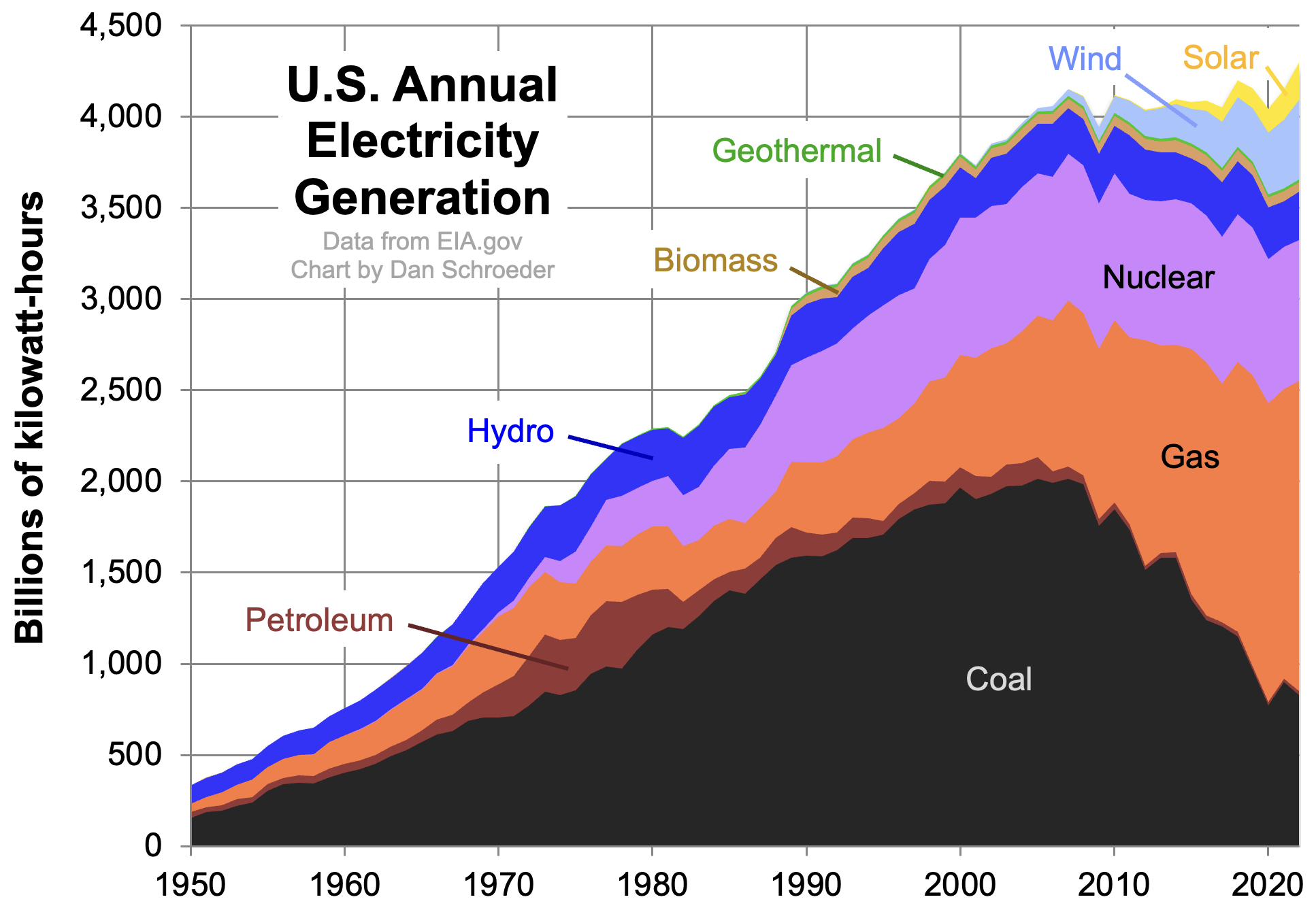
The data for 2007 and 2020 is from the EPA’s eGRID databases, while the data for 2021 is from the Energy Information Administration (forms 860 and 923). Plants that produced no power (or negative net power) during the indicated year are not shown. Only the 2020 dataset includes plants in Puerto Rico. As you can see, America’s electric power sector has been rapidly changing, with coal on the decline and gas, wind, and solar power on the rise. Here is a graph of total U.S. electricity generation, by source, from 1950 through 2022:
Here’s the same data plotted on a logarithmic scale, without the stacking:
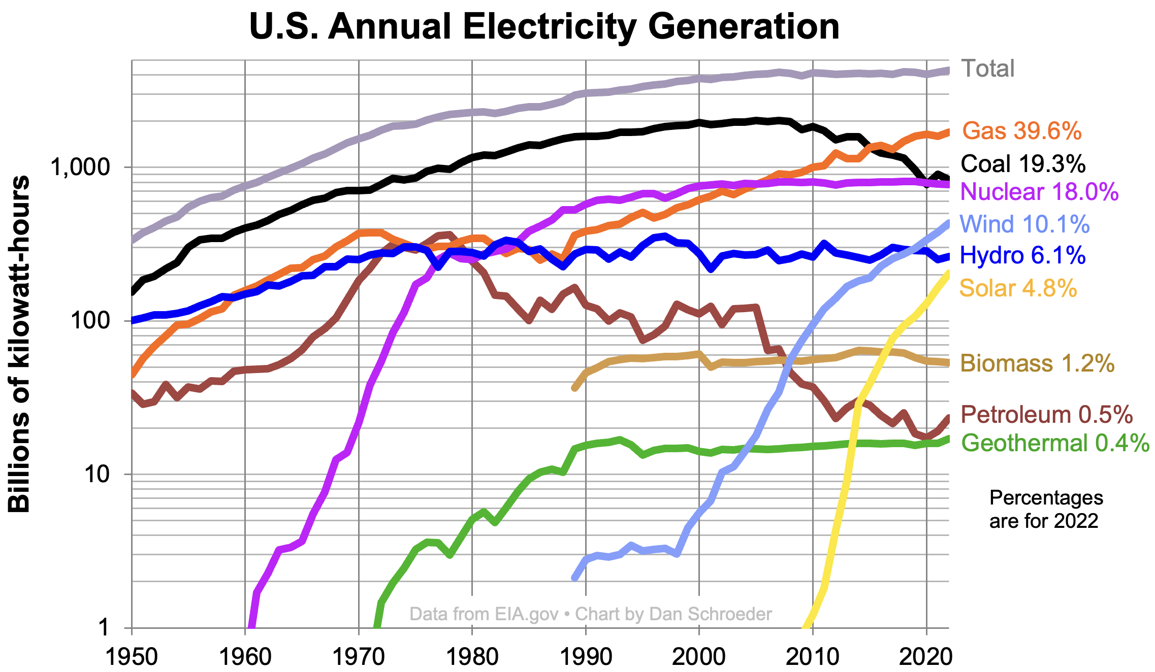
The year 2007 was an approximate turning point for U.S. electricity, when gas, wind, and solar power began to replace coal. Total generation rose almost without interruption through 2007, then was essentially flat through 2021, but may now again be on the rise.
Technical details: Some power plants obtain significant amounts of energy from more than one source, so the dot colors on the map can be somewhat misleading for these; the popup text will then indicate what percentage of the electricity was generated from the primary source. These multi-fuel plants also make the displayed totals for individual fuel types somewhat inaccurate. The vast majority of greenhouse gas emissions from power plants are carbon dioxide (CO2), but some plants emit other greenhouse gases as well, so CO2 equivalent, or CO2e, is used here. The “Other” category is defined in the eGRID documentation as “other unknown/purchased/waste heat”. Rooftop solar panels and other “behind-the-meter” generation are not included in the data shown on the map, though the two static charts do include it; the Energy Information Administration estimates that small-scale solar generation is about 40% as much as utility-scale solar generation.
You can find similar maps and visualizations on many other web sites:
- eGRID Data Explorer can display essentially all of the eGRID data for 2018 through 2021. If this tool had existed a few years earlier, I probably wouldn’t have bothered to make my own interactive map. My only complaint about the Data Explorer (aside from its not showing data prior to 2018) is that it bins the dot sizes too coarsely, making it harder to see at a glance how different power plants compare to each other.
- Chris Loer’s electricitytransition.com site is an amazing visualization of how U.S. electricity generation has changed on a month-by-month basis, from 2001 up to the present. You can Zoom in to see power plants mapped as individual dots, but it’s not ideal for comparing one energy source to another over a wide area. Loer’s terrific documentation was what prompted me to go directly to EIA for more recent data, rather than waiting for EPA’s next eGRID update.
- CarbonBrief has a nice interactive map showing U.S. power plants by nameplate capacity and energy source.
- The Washington Post has a well-designed set of static maps of US power plants, last updated in 2017. An earlier version of the WaPo page inspired me to make this one, because I wanted to see the dots sized by energy generated rather than just by nameplate capacity as they are there. That page also has a neat interactive graphic of generation by state.
- The U.S. Wind Turbine Database Viewer (a product of the U.S. Geological Survey, Lawrence Berkeley Lab, and American Clean Power) maps all U.S. wind farms down to the level of individual wind turbines.
- The Solar Energy Industry Association has an interactive map of major solar farms, including those still under construction or under development. This page summarizes the map’s content and limitations.
- The Sierra Club has a map of just coal-fired power plants in the U.S., focusing on their retirement status and providing a good visualization of how quickly they’re shutting down.
- EIA’s U.S. Energy Mapping System maps not just power plants but also an incredible variety of other energy infrastructure including transmission lines and mining/drilling areas.
- Here is an interactive chart of all primary energy use in the U.S. (not just electricity), broken down by source, since 1800.
- For international electricity data mapped and plotted by country, there's no better site than Our World in Data.
- 4C Offshore maintains a detailed international map of offshore wind farms, existing and proposed.
This page was created by Daniel V. Schroeder, Physics Department, Weber State University. Use your browser’s View Source or Page Source command to view the source code and open-source (MIT) license. Links to the data files are in the source code. To process the EIA data I used a Python script, posted here.
This interactive map uses my personal Mapbox free “starter” account, which has a limit of 50,000 map views per month. I'm not sure what constitutes a map view or how likely it is that the limit will be reached. Please contact me if you encounter difficulties.