All dates on this page correspond to when the information was first reported to the public on the UDOH web site.
The charts on this page may therefore differ from charts on the UDOH site, most of which back-date
the data to the date when the test was performed, the diagnosis was made, or the hospitalization
or death occurred. Both methods of plotting the data have their advantages. The advantage of the
charts on this page is that they allow consistent comparisons of the latest daily updates to past trends
in those same daily updates.
For further information: To see how Utah compares to other states according to a variety
of COVID-19 measures, check out the map and tables at covidexitstrategy.org.
Wikipedia has a useful timeline of how the pandemic
has played out in Utah, and of the measures taken to combat it.
Last update:
State-wide trends
The solid curves show the 7-day averages, to smooth over daily fluctuations and weekend
reporting lags. Each average is over the date shown and
the six previous dates.
Note: On July 16 the UDOH site began displaying
the number of “total tests reported”
alongside the number of “people tested”. These numbers are different because many people have been
tested more than once. I have modified the title of the first chart below to clarify that it shows the
number of people tested.
Daily new people tested for COVID-19 in Utah
With 7-day trailing average
Current 7-day average:
Total people tested:
Reporting of test dates was inconsistent before 20 Mar 2020.
Daily confirmed COVID-19 cases in Utah
With 7-day trailing average
Current 7-day average:
Total confirmed cases:
Daily new COVID-19 hospitalizations in Utah
With 7-day trailing average
Current 7-day average:
Total hospitalizations:
There were 73 hospitalizations during March 2020, before reporting began.
Daily COVID-19 deaths in Utah
With 7-day trailing average
Current 7-day average:
Total deaths:
Comparing Utah COVID-19 testing, cases, hospitalizations, and deaths
Based on 7-day averages;
“case” means confirmed case
Summary of numerical ratios
Cumulative
Last 7 days
Confirmed cases per person tested
Hospitalizations per confirmed case
Deaths per confirmed case
Geographic variations
The coronavirus pandemic has affected Utah’s different regions unequally. To see these variations
at a broad scale we can look at the confirmed case numbers for Utah’s 13 health districts,
each of which consists of one or more counties.
You can use the following interactive map to display the district-level case numbers in a variety of ways.
Click or tap on a district to see that district’s data.
Note that the map does not show the large variations that can occur within a district; some of the
maps at the UDOH site do a good job at that.
The population estimates are from the U.S. Census Bureau, for the year 2019.
Confirmed COVID-19 cases by health district
Colors indicate average daily cases per capita for 7 days ending Jun 7
Date:
Daily averages Cumulative totals
Per capita
Bear River District
Population:
1,234,567
Total cases as of
Jun 11:
6,543
per million residents:
5,432
Average daily cases:
123
per million residents:
111.1
The following bar chart shows the same data as on the map above, but omits the geographic
information while making it easier to quantitatively compare districts.
Confirmed Utah COVID-19 cases by health district
[subtitle]
Date:
Daily averages Cumulative totals
Per million residents Expand scale
The next two charts make it easier to see the trends.
The first shows the absolute case numbers by district and date, with a 7-day average (the black line) for
the sum of all districts shown. The second chart puts the 7-day averages on a per-capita basis (actually
per million residents). Use the checkboxes to select which districts to include in these two charts.
Daily confirmed COVID-19 cases
For selected Utah health districts
Cumulative total for selected districts:
Daily average (last 7 days):
Bear River
San Juan County
Summit County
Utah County
Central Utah
Southeast Utah
Tooele County
Wasatch County
Davis County
Southwest Utah
TriCounty
Weber-Morgan
Salt Lake County
7-day/statewide avg.
Average daily confirmed COVID-19 cases per million residents
7-day trailing average, for selected Utah health districts
Footnote: Do confirmed cases provide a fair comparison?
(Please note that this addendum has not been updated since May 26, 2020.)
It is reasonable to wonder whether comparing the numbers of confirmed cases across districts gives
an accurate picture, when testing for the virus may be more available in some districts than others.
(This is a major issue when comparing
states
or countries.) Could it be that the low numbers of
confirmed cases per capita in most of Utah's rural areas are partly or entirely the result of a shortage
of testing there? The major outbreaks in the Navajo
Nation and the
Logan-Hyrum
area have shown that
testing can be slow to reach disadvantaged sub-populations. On longer time scales, however, there seems to be no
shortage of testing in Utah’s rural districts.
The UDOH web site does not provide district-level testing numbers, but seven of the districts (including
the five largest ones) provide these numbers on their own web sites. Here are the available data as of May 26, 2020:
(I calculated the last row from the first seven and the state-wide numbers.) Tentatively, then, it
appears that testing is widely available (at least by U.S. standards) across the state of Utah.
Furthermore, the percentage of positive tests seems to be directly correlated with the number of
cases (or the population density), suggesting that further testing would turn up more cases in
those areas that already have the most confirmed cases (and hence increase the disparities displayed
in the charts above). It is unfortunate, though, that we don’t have district-level testing numbers
for the three districts that have (as of May 26) the highest per-capita rates of confirmed cases.
As a further check, we can use data from the UDOH web site to compare district-level hospitalization
rates. A higher ratio of hospitalizations to confirmed cases could be an indication that more mildly
symptomatic cases are going undetected.
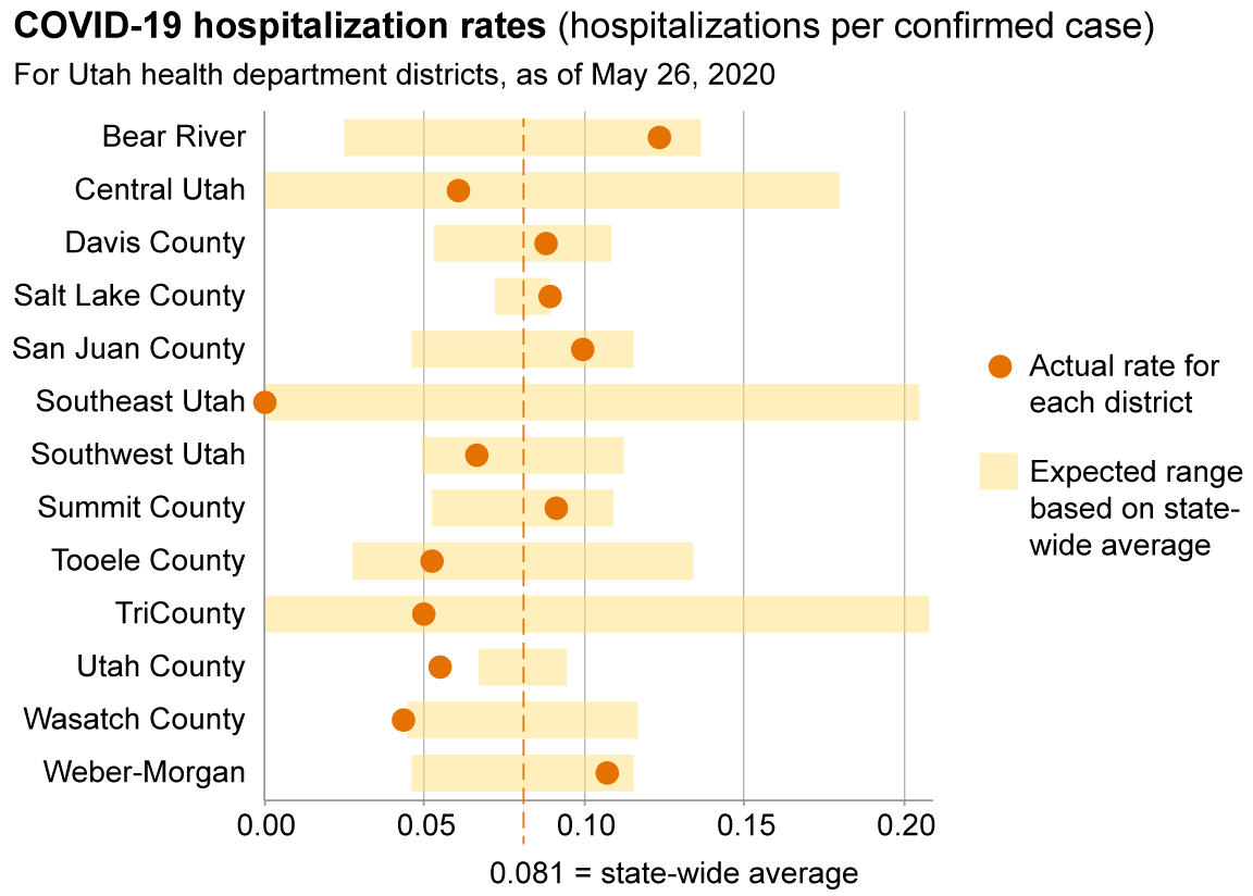
As of May 26, the cumulative state-wide hospitalization rate is 0.081 (hospitalizations per confirmed
case). The district-level rates vary from this value, but we would expect these data to be noisy, especially
for the smaller districts. In the chart below I’ve compared the district-level rates to the approximate
range that we would expect, given the limited statistics, if each person confirmed to have the virus
had the same (independent) probability of being hospitalized. (Technically, the displayed range is two standard
deviations to either side of the state-wide average.)
The fact that no district has a hospitalization rate above the expected range suggests again that
testing is widely available throughout Utah, with plenty of mildly symptomatic cases being included
in the data for every district. The only discrepancy that might be statistically significant is in
Utah County, where the hospitalization rate is unexpectedly low (yet we know that Utah County’s
positive test rate is slightly above the state average). Salt Lake County’s hospitalization rate and
positive test rate are both somewhat on the high side, so it seems likely that further testing
there would turn up more mildly symptomatic cases.
This web page created by Dan Schroeder,
Physics Department, Weber State University.
Feel free to copy and share. Use your browser to view the source code, numerical data, and open-source (MIT)
license. I am grateful to Weber State University for hosting this web page and for supporting faculty
scholarship in many other ways, but readers should understand
that this is a project of an individual faculty member, and that neither Weber State University nor the
Physics Department is responsible for the content of this page.